eb design can sometimes feel like a bit of alchemy, especially for the uninitiated. Although beginners can usually recognize what makes a good website, concocting the perfect elixir from scratch rarely happens.
As web designers toil over bubbling liquids, complex instruments, and the ever-tedious conversions between RGB colors and hex codes, they all hope to find the magical combination that strikes the ultimate balance between innovation, creativity, and business prowess. Success means a lifetime of pride and riches, while failure subjects the mad scientist to a lifetime of frustration and perpetual experiments.
via GIPHY
Unlocking a robust design for your new or existing website can seem like a magical process of transformation, creation, and combination. Professional themes and templates abound for nearly every business objective and creative endeavor — but there always seems to be something missing that makes the alloy not quite as strong as you envision it needs to be.
The design of your website, much like the mysterious recipe for gold, is a complicated, mysterious, sometimes infuriating process — that is worth getting exactly right.
Modern website design is more than just visual elements and aesthetics; it also affects your SEO and rankings, powers your audience’s perceptions of your brand, and influences your visitors’ behaviors. Your site’s design and layout affect your entire web presence.
Whether you’re starting from scratch, redesigning your perpetual fixer-upper, or evaluating an endless stream of templates, there are a few key recipes to follow and ingredients to use. Here, we’ll cover the base elements that, when used in the appropriate manner and measurement, can turn your online business and design dreams into gold.
First, Take Care of the Tech Stuff — Or Have Your Host Do It For You
You thought web design was all about choosing the right color palette and imagery, right? Well, you’re not wrong, per se. We’re just taking a more comprehensive look at using design to improve and influence your users’ experience on your site.
The world’s best design won’t matter if your visitors can’t see your site or don’t stick around long enough to convert. No matter your audience, internet consumers are a somewhat impatient bunch — roughly 30 percent of them expect a site to load in one second or less, while almost half count on a website to appear within two seconds. Any millisecond beyond that increases your odds of losing that reader or shopper for good.
via GIPHY
The same can be said for sites that don’t load at all. Data center outages can cost businesses an average of $9,000 per minute its website is unavailable, according to the Ponemon Institute. Nearly three-quarters of visitors will abandon a site if it takes more than five seconds to load.
Signing up with a reliable web hosting provider alleviates all those pain points without any hassle or headaches. For example, DreamHost uses high-performance solid-state drives in our servers, which are at least 200% faster than traditional hard disk drives. Uptime guarantees are another vital measurement to consider when evaluating reliability. DreamHost is one of the few providers that promise your site will be online 100% of the time — we’ll even reimburse you for an entire day’s worth of hosting for every hour your site is unavailable.
If all of that is not enough to convince you, consider checking out monthly hosting plans that let you sample the type of performance, reliability, and customer service you can encounter. (By the way, that’s another area DreamHost excels in, according to the folks at HostingAdvice.com).
Website Design Elements, Simplified
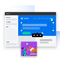
Build a beautiful site with confidence when you use our drag-and-drop website builder.
6 Key Components of Web Design
Now we can get into the fun stuff like colors, typography, call-to-action buttons, white space, and navigation! Every designer, web developer, and site owner may take a different approach to build a website, but there’s a standard checklist of items and concepts that should be accounted for.
Of course, while there are generally accepted design principles, the beauty of web design is that it’s an art form — not a science. Good design stands out from the crowd, but be sure the risks you take are calculated and reversible if they don’t pan out how you’d like.
Now, time to turn the page on that sketchbook and start designing! Here are six important design elements you’ll want to make sure you get right.
1. Overall Layout and Visual Appearance
Your site’s overall look is, of course, a crucial component of web design. We’re using these broad terms to cover a range of reactions you want your website visitor to have. First impressions are critical, so you want to wow your target audience as soon as the web page loads. Users take only 50 milliseconds to form an opinion of your website or business, and that will determine whether they’ll stay or leave.
That means your design should align with a handful of soothing adjectives: it should be simple, familiar, intuitive, clean, and accessible. Use plenty of whitespace (or padding and margins) to give the elements of your site room to breathe, and use grid-based designs to keep design items organized and orderly.
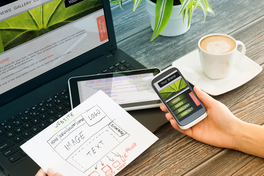
Strong photography, icons, or graphics provide supplementary information to your text but make sure the images complement each other and the brand you’re looking to represent.
Each piece of your website should be placed according to the visual hierarchy you want to assign it. Whether you aim for F-Patterns or Z-Patterns, you can direct visitors’ eyes and behaviors based on your design. Both patterns emphasize the top horizontal area of your site, or where most designers place the brand’s logo, navigation, and sometimes a search box. All three elements inspire brand recognition and user interaction.
Related: How to Design a Logo for Your Website That Visitors Will Love
2. Color Scheme
Finally, the elements you were probably expecting the most once you started reading. Your color palette and fonts will directly inform your visitors’ opinions of your site and are what most novice designers start with. Trust us, the groundwork you’ve done so far will set you up for greater success than Roy G. Biv alone.
As for choosing a color scheme, paying attention to your brand or industry perspectives — along with your target audience demographics — will make this a somewhat painless process. Always be looking for ways to narrow your scope from the roughly 7 million discernable hues the eye can detect.
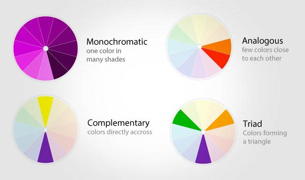
Lawyers and accountants, for example, would typically be best served with a deep blue or green to signal professionalism, while a photographer may want to rely on black and white to truly showcase the vibrancy of his or her images. Beyond your brand’s industry, pay attention to your readers’ expectations: Parents of newborns will appreciate soft pinks and blues and yellows, while K-6 children expect bright primary colors. Teens and young adults are bold, while grownups and grandparents are a bit more refined and mature.
Once you choose your dominant color, consider what type of color palette you want. Suppose you want your audience to zero in on a particular piece of content or a button or elicit a specific type of interaction. In that case, you’ll want a complementary color from the other side of the color wheel. We spent an entire blog post exploring color choices, so head on over there for more help.
3. Typography
The same industry and demographics principles can generally be said for the typography (or fonts) you choose to communicate your message. More formal roles, like those lawyers and accountants, will likely want to stick with distinguished serif fonts (which have the extra bits hanging off at the end of letters), while we envision the photographer would use a very light and airy sans serif (no extra bits) typeface.
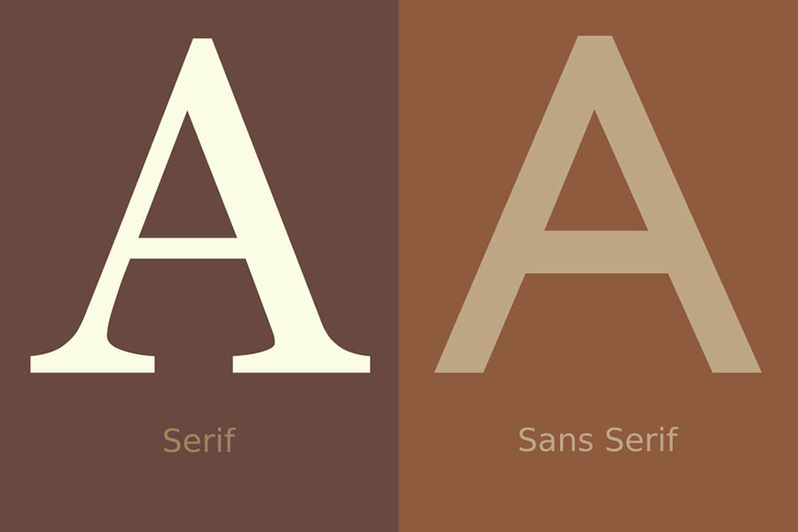
As with the site’s overall design and layout, you’ll want to balance normalcy with freshness. Design aficionados will spot Arial or Times New Roman right away. Look for something a little different — but whatever you do, don’t even consider Comic Sans.
Your text should be easily readable, which generally means body copy should be at least 16 pixels. Using a complementary font is ideal for headings or accents, but don’t go beyond three typefaces or unnecessary sizing adjustments.
Of course, you’ll want to make sure there’s plenty of contrast between your text and the site’s background colors, which generally means a light color paired with a dark tone — avoid that piercing red-font-on-green-background eyesore.
We doubled our blog’s traffic with WordPress
We'll show you how to do it. Join 150,000+ others who get our monthly newsletter with insider WordPress tips!

4. Navigation
Your site’s navigation is not a space in which to be creative. First off, don’t fall into the trap of overly animated hover effects and complex, multi-tiered subnavs. Navigational elements — which can exist in a site’s header, body, and footer — simply serve to direct your visitors to the information they desire as quickly as possible.
Right at the top of the page, site owners will be confronted with a majorly polarizing design decision: to hamburger or not to hamburger? The hamburger menu, represented by three parallel, horizontal lines, provides an economical way to save space by hiding your navigation off-site. However, it obscures vital information and interactions from your visitors and tends to have lower click rates.

Strong navigation extends beyond the main menu in your header. For long, scroll-heavy, or one-page designs, for example, you may want to include directional arrows that help direct users through each section. Most sites will also benefit by adding a sticky “Back to Top” button that quickly delivers visitors back to the top of the page (here are some research-based suggestions from the Nielsen Norman Group on how to best implement this navigational element).
Finally, don’t ignore the footer navigation menu. Users tend to scroll farther than you might expect, and some brands even witnessed up to 50% more conversions with an optimized footer. If a reader has stuck around long enough to make it to the end of your homepage or landing page, they’ll need somewhere else to go or something else to do, such as sign up for email updates from your business.
Related: Everything You’ll Ever Need to Know About Website Footers
5. Content
Just as interior designers don’t stop once the walls are painted, you’re not done once you’ve got the layout, color scheme, typefaces, and pretty elements of your choice picked out. Time to bring in the sofa and hang family pictures on the wall — by paying attention to how your messaging interacts with your design.
Your site visitors and potential customers want information quickly — is your brand trustworthy? Experienced? Capable of delivering top-notch products and services? Given people’s short attention spans and lightning-fast first impressions, communicating clearly is critical. Information should be easy to read and digest.
Look closely at each word: Do you really need it? Efficiency is key, as extra words can stand in the way and dull your brand’s primary selling points. Use headings and display text to organize sections and quickly let your readers know what information you’re providing. Instead of using long, rambling sentences, break up long lists into ordered or unordered lists. Just think short and sweet!
As far as content strategy goes, don’t forget to look beyond your blog or homepage. Make sure your “About” and “Contact” pages take the appropriate tone and convey the right information. For example, a lifestyle blogger will want to share her personal and family journey, while a real estate agent will likely be more focused on professional results.
Related: 17 Great About Us Pages to Inspire You
6. Don’t Forget About Mobile
Phew! Finally, we’re nearing the end of our web design odyssey with a sleek, compact, user-friendly website. Ready to do it all again — but smaller?
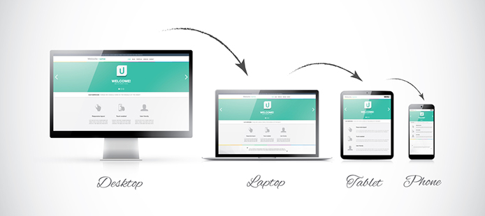
The amount of mobile web traffic overtook desktop traffic five years ago and shows no signs of slowing down.
To better serve visitors who access your site on a phone or tablet, Google introduced a mobile-first index to rank sites in search results nearly six years ago. And in May 2021, the search engine is rolling out Core Web Vitals, a set of metrics to measure how well your site delivers a quality user experience. The better your site performs for users (including on mobile devices), the more likely Google will give you a rankings boost.
Long story short, mobile-friendly websites aren’t just a nice, hip feature anymore — they’re a necessity.
Most WordPress themes or templates you buy from a developer already come prepared for mobile traffic. If you’re designing your own custom look or hiring a web designer, however, you’ll need to make sure you’re covered by one of two main options: a responsive template that adapts to various screen sizes or a mobile-only look that is activated when a non-desktop device tries to access your site.
Get a Stunning Website Designed from Scratch
Now that you’ve learned about the key elements of web design, it’s time to build your website!
At DreamHost, we make it easy for DIYers to launch a website fast with our drag-and-drop WP Website Builder. But if you’re looking for a polished, custom WordPress website that’s 100% unique to your brand, consider our Custom Website Design service.
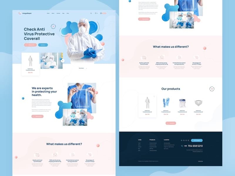
Here’s how the process works: You’ll start with a 1-on-1 call with your project manager to guide you through the requirements form where we collect content and define your goals. Then we’ll gather your existing logo and key branding materials into a simple, one-page reference sheet to ensure your website design matches your brand.
Next, our pro designers will create a custom prototype of your new website for you to easily offer feedback. Once you’ve approved, we’ll code it into a high-performance WordPress website. We make sure you’re satisfied with the final product by including revisions from the get-go; you’ll get two rounds of design revisions and two rounds of code revisions for every page on your site.
Your finished website will be SEO-ready, mobile-responsive, and loaded with features — custom blog, content forms, analytics, and e-commerce functionality. For an additional fee, we’ll even upload products to your online store for you.
If you’re ready to move beyond a stock template, check out our Custom Website Design service today!
